Skip to content

uzbekdev1/HandyControls


Folders and files

NameName
Last commit message
Last commit date

Latest commit


Repository files navigation

logo

dotnet-version csharp-version IDE-version nuget-version Gitter wiki Nuget

Welcome to HandyControl

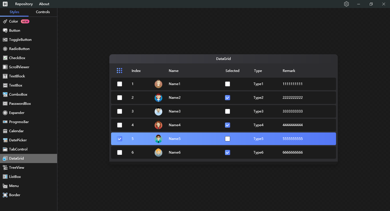
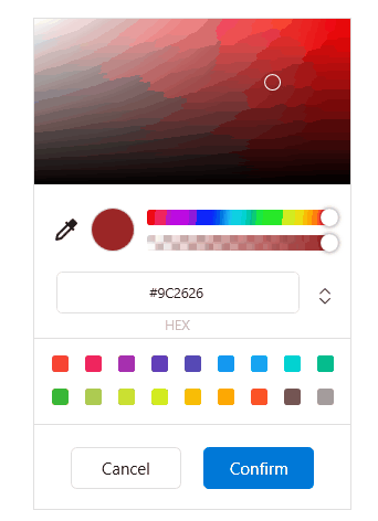
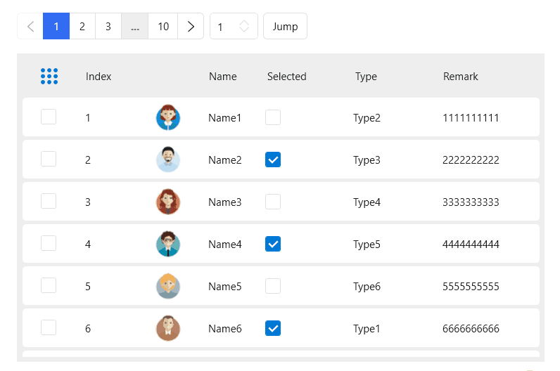
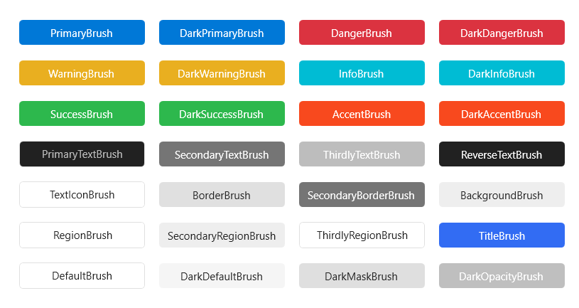
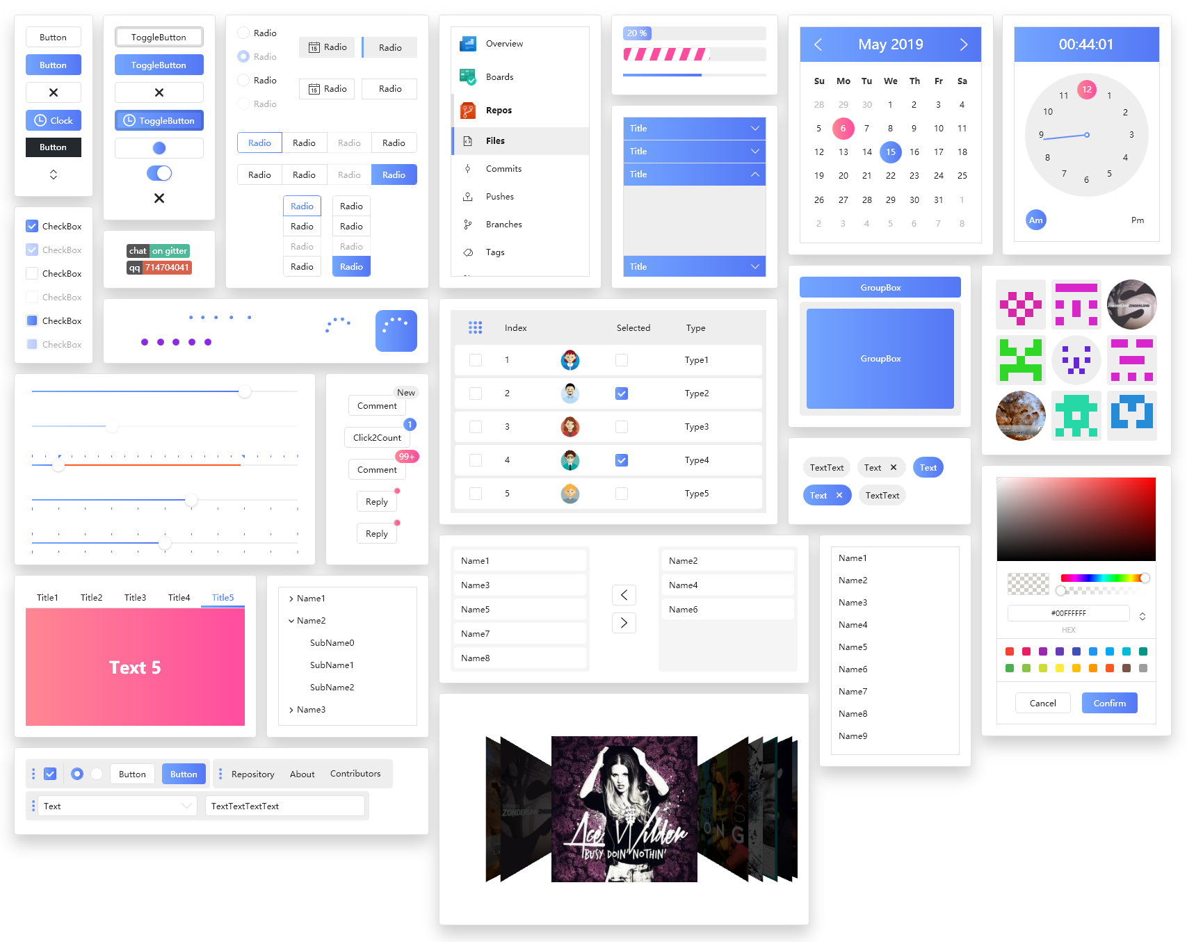
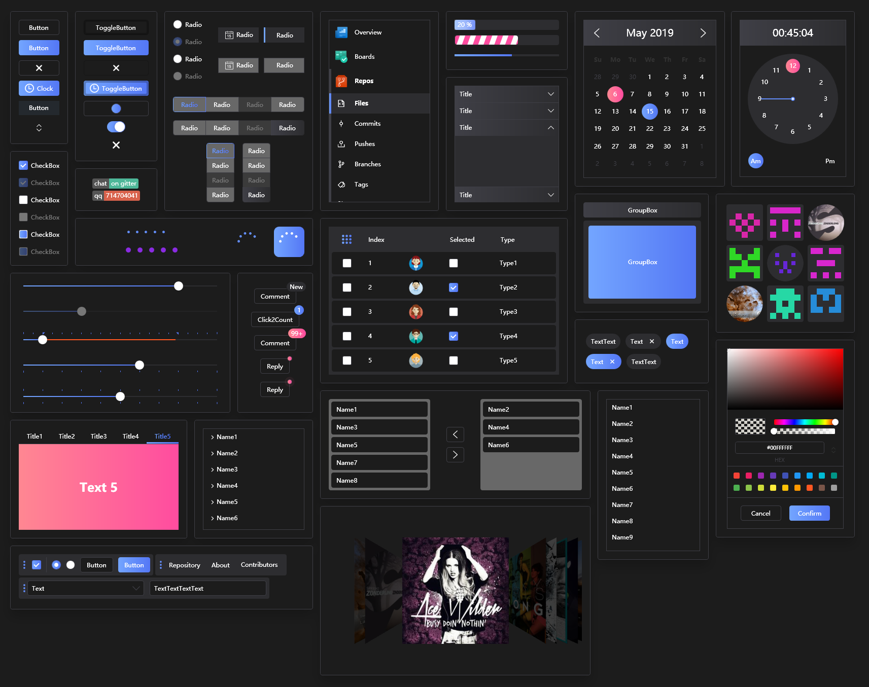
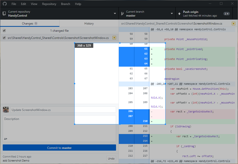
This project is based on HandyControl But this project includes some controls and features that are not included in the original project[For example, support for Persian Calendar] See the changes here

Contributors

Backers

Special thanks to

Visual Studio Community 2019 JetBrains Cake AppVeyor Gitter

Usage

Step 1:Add a reference to HandyControl or search for HandyControl on the nuget;

Install-Package HandyControls

Step 2:Add code in App.xaml as follows:

<Application.Resources>
    <ResourceDictionary>
        <ResourceDictionary.MergedDictionaries>
            <ResourceDictionary Source="pack://application:,,,/HandyControl;component/Themes/SkinDefault.xaml"/>
            <ResourceDictionary Source="pack://application:,,,/HandyControl;component/Themes/Theme.xaml"/>
        </ResourceDictionary.MergedDictionaries>
    </ResourceDictionary>
</Application.Resources>

Step 3: Add NameSpace: xmlns:hc="https://handyorg.github.io/handycontrol"

Step 4:enjoy coding

VSIX packages for Visual Studio

VS2019

Overview

Overview

Overview-dark

Latest examples

Screenshot

Screenshot

GooeyEffect

GooeyEffect

GlowWindow

GlowWindow

FlowDocumentScrollViewerStyle

FlowDocumentScrollViewerStyle

PinBox

PinBox

History publication

Effects

Effects

RelativePanel

RelativePanel

Drawer

Drawer

Poptip

Poptip

Divider

Divider

GeometryAnimation

GeometryAnimation

SplitButton

SplitButton

FloatingBlock

FloatingBlock

HoneycombPanel

HoneycombPanel

RunningBlock

RunningBlock

ImageBlock

ImageBlock

ImageBlock

Magnifier

Magnifier

Card

Card

ButtonGroup

ButtonGroup

Grid

Grid

SideMenu

SideMenu

NotifyIcon

NotifyIcon

Dialog

Dialog

WaveProgressBar

WaveProgressBar

Badge

Badge

Gravatar

Gravatar

GoToTop

GoToTop

ChatBubble

ChatBubble

Label

Label

Transfer

Transfer

ProgressButton

ProgressButton

CoverFlow

CoverFlow

CoverView

CoverView

MessageBox

MessageBox

WaterfallPanel

WaterfallPanel

Rate

Rate

BlurWindow

BlurWindow

FlipClock

FlipClock

Shield

Shield

OutlineText

OutlineText

Tag

Tag

ToolBar

ToolBar

Slider

Slider

CircleProgressBar

CircleProgressBar

ButtonStyle

ButtonStyle

ToggleButtonStyle

ToggleButtonStyle

RadioButtonStyle

RadioButtonStyle

CheckBoxStyle

CheckBoxStyle

ListBoxStyle

ListBoxStyle

TreeViewStyle

TreeViewStyle

ListViewStyle

ListViewStyle

DataGrid

DataGrid

Now you can switch to dark theme

dark theme

ColorPicker

ColorPicker

Loading

Loading

Carousel

Carousel

Pagination

Pagination

Expander

Expander

TimeBar

TimeBar

ImageBrowser

ImageBrowser

PreviewSlider

PreviewSlider

CompareSlider

CompareSlider

CompareSlider

Growl

Growl

AnimationPath

AnimationPath

ProgressBar

ProgressBar

TabControl

TabControl

TabControlStyle

TabControlStyle

GroupBox

GroupBox

StepBar

StepBar

GifImage

GifImage

ContextMenu

ContextMenu

Calendar

Calendar

Clock

Clock

CalendarWithClock

CalendarWithClock

TextBlock

TextBlock

RichTextBoxStyle

RichTextBoxStyle

TextBox

TextBox

ComboBox

ComboBox

NumericUpDown

NumericUpDown

SearchBar

SearchBar

PasswordBox

PasswordBox

DataPicker

DataPicker

TimePicker

TimePicker

DateTimePicker

DateTimePicker

ScrollViewer

ScrollViewer

CirclePanel

CirclePanel

TransitioningContentControl

TransitioningContentControl

BorderStyle

BorderStyle

Brush

Brush

Switching configuration

Switching configuration

About

Contains some simple and commonly used WPF controls based on HandyControl

Resources

License

Code of conduct

Stars

Watchers

Forks

Packages

No packages published

Languages

  • C# 99.6%
  • Other 0.4%