A project to create a map with every ringable set of bells on it. This code was made to run in Visual Studio on Windows, and since switching to Linux I have been unable to compile it so I will likely rewrite this in Rust in the future so that it is faster and more portable. It was also made quickly before I started my degree and as a result the code style, documentation and commenting is sub-par.
The idea behind this project is to create a poster-style map containing every ringable tower. In order to stand a chance of the tower names being visible, the map would be 1.5m by 1.5m and the text would be about 3mm tall (which is surprisingly legible). If the entire world was put to scale, the map would be impossible because 95% of the towers are in a tiny fraction of the world's surface area (i.e. the UK). So the map would be mainly England, with other places like America, Africa, Europe and Asia dotted around the outside where it fits. However, this is still not quite big enough, and many places in England have too many towers to label even after cities are removed. A pretty large re-think is required to get the labelling working, and the fact that I can't compile my existing code meant that I've shelved this project for the time being. I do intend to come back to it, though, if enough people would be interested in a map like this.
The first part of the project was to procure the data required to make the maps. For the coastlines, I used the snappily named Global Self-consistent, Hierarchical, High-resolution Geography Database, and for the towers of course there's Dove's Guide. With some preprocessing in Python to handle things like filtering out the vast numbers of coastlines not needed in the map and turning Lat/Long coords into OS grid coordinates to prevent the UK from getting really squished, the coastline and tower data was cached for C# to turn into the map.
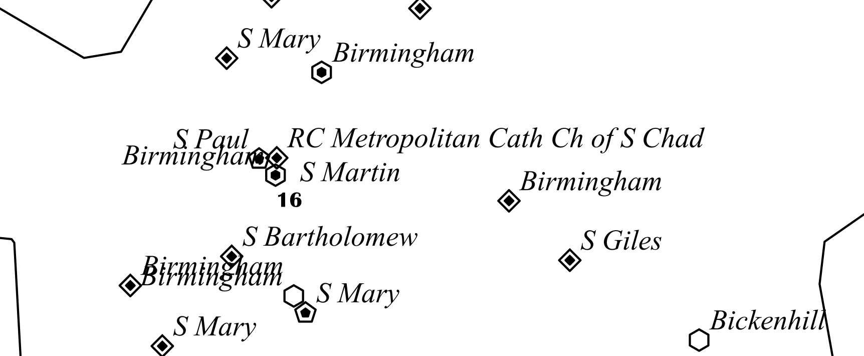
Now came the real challenge of making a map with 7000+ labelled points on it whilst having the result be easily parsable by a human. I tried many methods of denoting bell numbers, but the one I settled on eventually was to exploit the observation that there are no towers on Dove's with 7, 9 or 11 bells since these are all rounded down to the nearest even number. Therefore, our label design only had to deal with rings of 3, 4, 5, 6, 8, 10 and 12 bells (and only 4 towers have more than 12 bells, which could be handled separately). The final design was to use polygons who's total number of sides was the number of bells (so for example, two pentagons inside each other corresponds to a 10). This worked fantastically, because the most complex shape used is a hexagon, no colour information is used so unringable towers can be grey, and it's easily legible even when the points are about 2mm in size. Below is a screenshot of Birmingham with a very early version of the label placer which is freaking out a bit:
Two issues became apparent early on in the process. First issue is that the naming system used thus far - just using the 'place' field from Dove's - was never going to cut the mustard when it came to cities or towns, since you'll get a whole swathe of identically labelled towers, which is not useful:

However, you cannot just filter for unique tower names because many towers share common place names but are many miles apart (for example the name of my home tower, Stone, is shared by at least 2 other ringable towers both of which are in completely different parts of the country). So a distance cutoff was made for when two towers of the same name had to be labelled using the dedication instead of the place name. This in general worked really nicely and a bit of geographic intuition goes a long way to figuring out the place names.
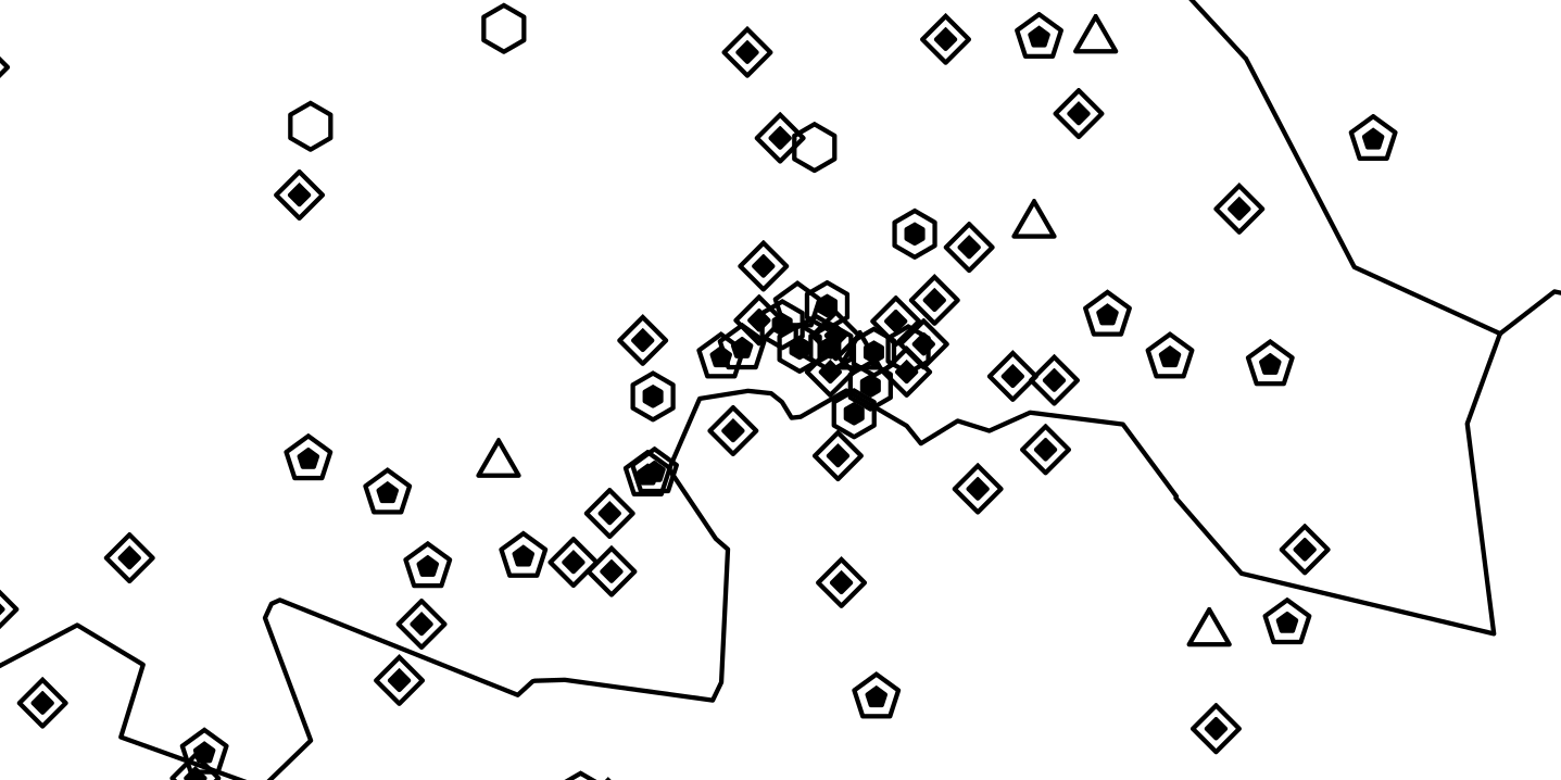
Another issue is that of cities. To start with, the map generator would treat cities the same as the rest of the map and so they would turn into a blobby mess of towers all very close together which are impossible to label (although my point design is clearly working because the bell numbers are still identifiable):
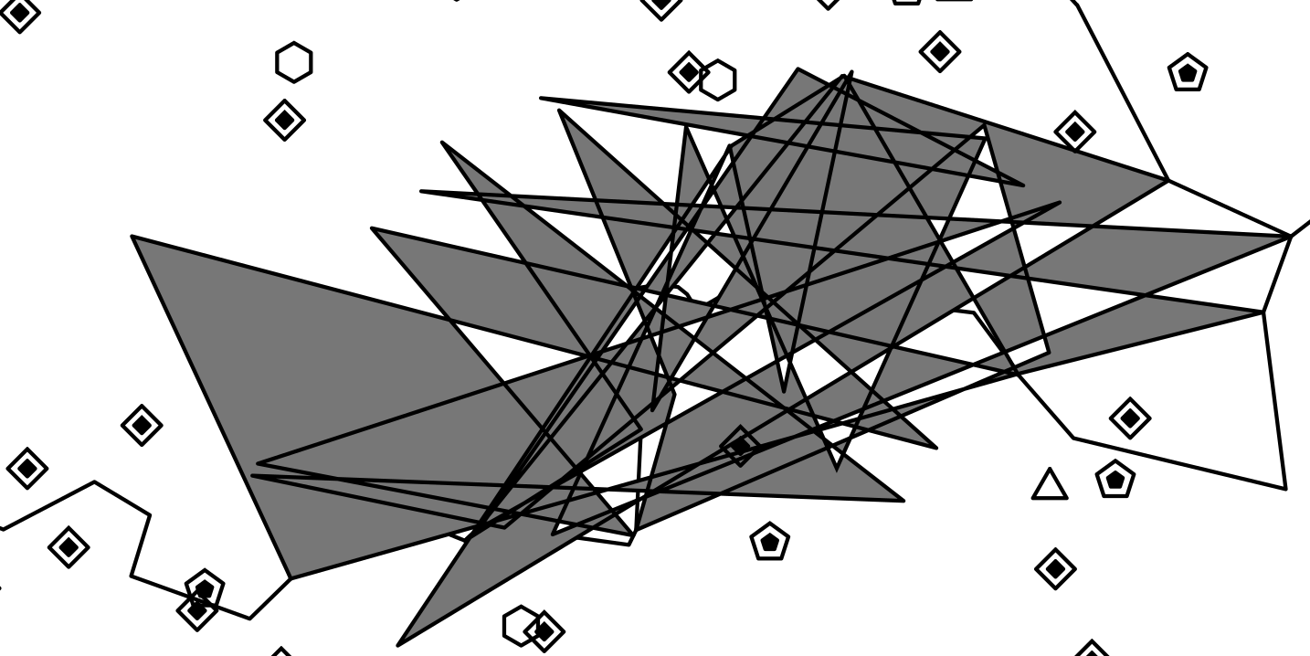
My intended solution to this (which never got fully implemented before switching to Linux) was to find the cities, remove them from the map, and display them enlarged round the edge of the map. The first part of this - city detection and border creation - was implemented, first with some strange results:
and then properly with some tweaking and bug-fixing. Here's a screenshot showing what I belive is the border around London before the coastline data was added:

The next two things to implement were the coastlines and the diocese borders. The coastlines were done simply by figuring out the numbers of the required polygons in the huge dataset, and then importing them (doing OS grid conversions where required) and then converting these points into a polygon for the SVG generator.
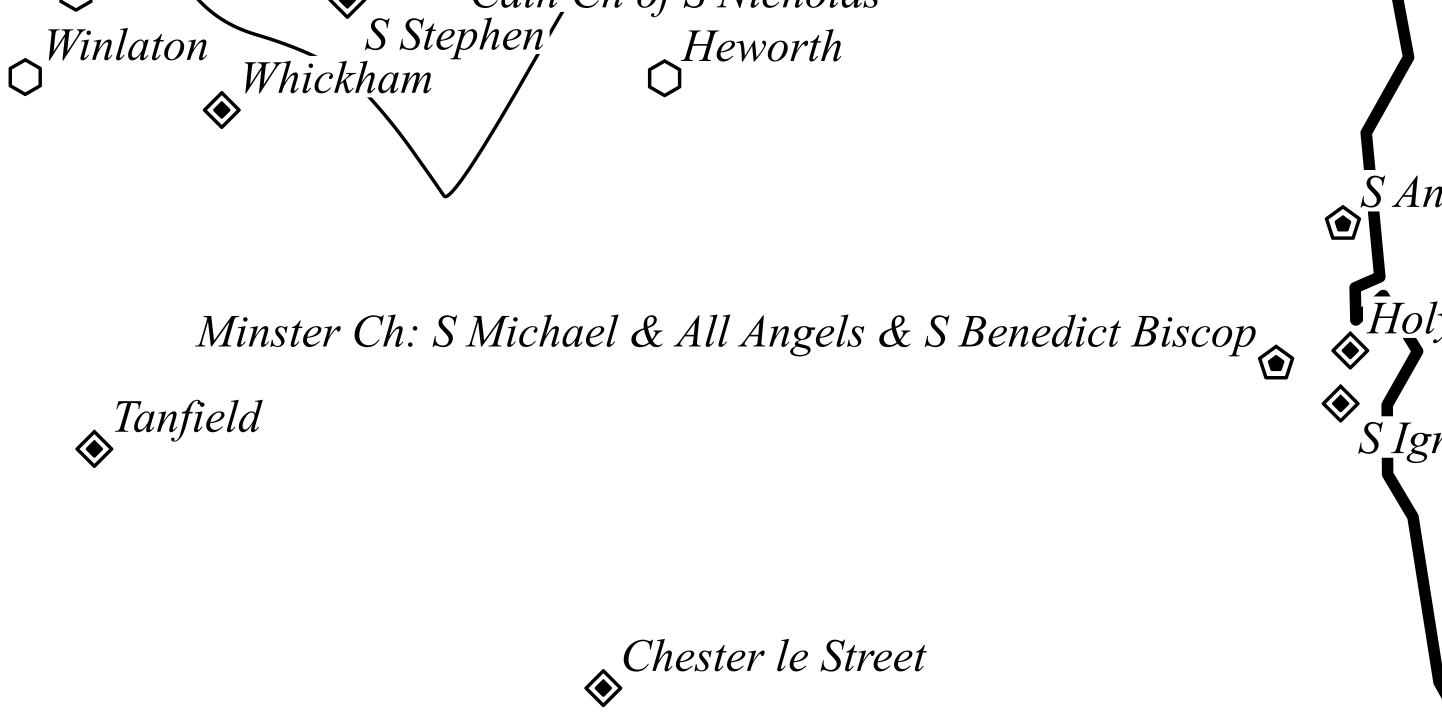
The diocese borders, on the other hand, are not so straightforward. There is not to my knowledge any dataset with them on, so I used an implementation of Voronoi's algorithm to determine the lines exactly halfway between each pair of adjacent towers, and add this to the map if the neighbouring towers are from different dioceses (with the obligatory task of dealing with pesky edge cases like towers with no dedications or privately owned towers). These lines were combined and converted into Bezier splines so that they looked better on the map. Now the map looked like this (the thick line on the right is a coastline and the thinner line is a diocese border). Note how the tower names have white rectangles behind them to prevent the text from clashing with the other lines:
At this point, the map's SVG file contained well over 20,000 shapes, many of them text elements or polygons which was causing huge stress to the SVG editor I was using to view them ... poor Inkscape. It is an unsung hero of this project.

Since the goal of this project is to create a real life paper map, I needed to find a way to print a 1.5m square poster with enough accuracy for the points to be visible. An excellent opportunity for testing a real copy of the map arose when I went down to Cornwall to visit my aunt who knows an architect who has, amongst many other interesting things, an A1 printer for printing architect's diagrams. Not knowing this in advance, I had to quickly adapt the code to print the map in slices which was messy but successful. However, the resulting SVG was so large that it exceded the RAM capacity of the printer. RIP. The only screenshot I have for this attempt is this one, with the map in slightly the wrong place:

This is as far as the screenshots go for this project. A few more things were completed before moving to Linux, such as starting work on a better label placer (potentially using some clever optimisation techniques such as simulated annealing) and embedding a nice title in the base of the picture. If anyone is interested in buying a map like this, I would be happy to recommence the project if it gains enough interest (the printing is niche enough that I would have to print in quite large batches).
Since you got to the end, thank you very much for reading! (if you skipped to the end, naughty naughty, please go back and read the rest ;P)
and yes, the output file was called final.svg this whole time. Some things never change...