This library has now been deprecated by the new Android Support Design Library. Please see the full component for a sample: https://components.xamarin.com/view/xamandroidsupportdesign
Interactive paging indicator widget, compatible with the ViewPager from the
Android Support Library.
This library requires Support v7 AppCompat Version 23
Must set Compile with API 23 in VS or XS
You must add Mono.Android.Export.dll to your References
Build status:
Ported from: https://github.com/jpardogo/PagerSlidingTabStrip
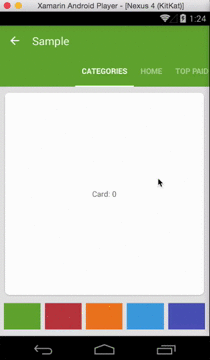
For a working implementation of this project see the Sample/ folder.
- Download the NuGet Package: https://www.nuget.org/packages/Refractored.PagerSlidingTabStrip/
Or add the library as a project.
-
Include the PagerSlidingTabStrip widget in your layout. This should usually be placed above the
ViewPagerit represents.<com.refractored.PagerSlidingTabStrip android:id="@+id/tabs" android:layout_width="match_parent" android:layout_height="?attr/actionBarSize" android:background="?attr/colorPrimary" />
-
In your
OnCreatemethod (orOnCreateViewfor a fragment), bind the widget to theViewPager.// Initialize the ViewPager and set an adapter var pager = FindViewById<ViewPager>(Resource.Id.pager); pager.Adapter = new TestAdapter(SupportFragmentManager); // Bind the tabs to the ViewPager var tabs = FindViewById<PagerSlidingTabStrip>(Resource.Id.tabs); tabs.SetViewPager(pager); -
If your adapter implements the interface
CustomTabProvideryou can pass your custom tab view/s. In case the view returned contains the idResource.Id.psts_tab_title, this view should be aTextViewand will be used to place the title. If you don't want the library to manage your TextView title for the tab, use a different id thanResource.Id.psts_tab_titlein your tab layout.If your adapter doesn't impelement the interface
CustomTabProviderthe default tab will be used (That's a TextView with idResource.Id.psts_tab_title). -
(Optional) If you use implement
IOnPageChangeListenerwith your view pager you should set it in the widget rather than on the pager directly.// continued from above tabs.SetOnPageChangeListener(pageChangeListener);
From theme:
android:textColorPrimaryvalue (from your theme) will be applied automatically to tab's text color (Selected tab with 255 alpha and non selected tabs with 150 alpha), underlineColor, dividerColor, and indicatorColor, if the values are not defined on the xml layout.
Notes about some of the native attr:
android:textSizeTab text sizeandroid:textColorNon selected tabs text color. If you DO definetextColorIt will be apply to NON selected tabs and NO ALPHA will be applied to them, the colour you define is the one you will see. If you want to define a half transparent color intextColor, you can pass #80FFFFFF (That's an example for half transparent white)android:paddingLeftorandroid:paddingRightlayout padding. If you apply both, they should be balanded.
Custom attr:
pstsIndicatorColorColor of the sliding indicator.textPrimaryColorwill be it's default color value.pstsUnderlineColorColor of the full-width line on the bottom of the view.textPrimaryColorwill be it's default color value.pstsUnderlineHeightHeight of the full-width line on the bottom of the view.pstsTextAlphaSet the text alpha transparency for non selected tabs. Range 0..255. 150 is it's default value. It WON'T be use iftextColoris defined in the layout. IftextColoris NOT defined, It will be applied to the non selected tabs.pstsTextColorSelectedSet selected tab text color.textPrimaryColorwill be it's default color value.pstsTextStyleSet the text style, default bold.pstsTextSelectedStyleSet the text style of the selected tab, default bold.pstsTextAllCapsIf true, all tab titles will be upper case, default true.pstsDividerColorColor of the dividers between tabs.textPrimaryColorwill be it's default color value.pstsDividerPaddingTop and bottom padding of the dividers.pstsDividerWidthStroke width of divider line, defaults to 0.pstsIndicatorHeightHeight of the sliding indicator.pstsTabPaddingLeftRightLeft and right padding of each tab.pstsScrollOffsetScroll offset of the selected tab.pstsTabBackgroundBackground drawable of each tab, should be a StateListDrawable.pstsShouldExpandIf set to true, each tab is given the same weight, default false.pstsPaddingMiddleIf true, the tabs start at the middle of the view (Like Newsstand google app).
Almost all attributes have their respective getters and setters to change them at runtime , open an issue if you miss any.
- [@JamesMontemagno] (http://twitter.com/jamesmontemagno)
- Andreas Stuetz - andreas.stuetz@gmail.com
- Original Repo: https://github.com/jpardogo/PagerSlidingTabStrip
- Check contributors list there
- Kirill Grouchnikov - Author of an explanation post on Google+
The MIT License (MIT)
Copyright (c) 2015 James Montemagno / Refractored LLC
Permission is hereby granted, free of charge, to any person obtaining a copy of this software and associated documentation files (the "Software"), to deal in the Software without restriction, including without limitation the rights to use, copy, modify, merge, publish, distribute, sublicense, and/or sell copies of the Software, and to permit persons to whom the Software is furnished to do so, subject to the following conditions:
The above copyright notice and this permission notice shall be included in all copies or substantial portions of the Software.
THE SOFTWARE IS PROVIDED "AS IS", WITHOUT WARRANTY OF ANY KIND, EXPRESS OR IMPLIED, INCLUDING BUT NOT LIMITED TO THE WARRANTIES OF MERCHANTABILITY, FITNESS FOR A PARTICULAR PURPOSE AND NONINFRINGEMENT. IN NO EVENT SHALL THE AUTHORS OR COPYRIGHT HOLDERS BE LIABLE FOR ANY CLAIM, DAMAGES OR OTHER LIABILITY, WHETHER IN AN ACTION OF CONTRACT, TORT OR OTHERWISE, ARISING FROM, OUT OF OR IN CONNECTION WITH THE SOFTWARE OR THE USE OR OTHER DEALINGS IN THE SOFTWARE.
This is a derivative of Javier Pardo de Santayana Gómez: https://github.com/jpardogo/PagerSlidingTabStrip Which is a derivative of Andreas Stütz: https://github.com/astuetz/PagerSlidingTabStrip