
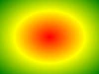
(this picture is draggable, check it out)
Draw breathtaking backgrounds in your Xamarin.Forms application today, from simple gradients to complex textures. It's a kind of magic ✨
| Supported platforms |
|---|
| ✔️ Android |
| ✔️ iOS |
| ✔️ UWP |
- Linear and radial gradients supported
- Draw as many gradients as you want with single control, blend them together for unique effects
- Supports CSS gradients, find your ideal background somewhere on the web and copy + paste into your app
- Make your background alive with built-in XAML animations 🙉
- Powered by
Magic Gradients are available via NuGet:

Install into shared project, no additional setup required.
To draw a gradient add GradientView control to your XAML page and create LinearGradient or RadialGradient as direct content.
<magic:GradientView>
    <magic:LinearGradient>
        <magic:GradientStop Color="Red" />
        <magic:GradientStop Color="Yellow" />
    </magic:LinearGradient>
</magic:GradientView>
It is also possible to add collection of gradients. You can mix linear and radial gradients, use transparency in color definitions to get blend effect.
<magic:GradientView>
    <magic:GradientCollection>
        <magic:LinearGradient Angle="45">
            <magic:GradientStop Color="Orange" Offset="0" />
            <magic:GradientStop Color="#ff0000" Offset="0.6" />
        </magic:LinearGradient>
        <magic:LinearGradient Angle="90">
            <magic:GradientStop Color="#33ff0000" Offset="0.4" />
            <magic:GradientStop Color="#ff00ff00" Offset="1" />
        </magic:LinearGradient>
    </magic:GradientCollection>
</magic:GradientView>
You can also build gradient in C# using GradientBuilder with Fluent API:
 var gradients = new GradientBuilder()
    .AddLinearGradient(g => g
        .Rotate(45)
        .AddStop(Color.Red, Offset.Prop(0.2))
        .AddStop(Color.Blue, Offset.Prop(0.4)))
    .AddRadialGradient(g => g
        .Circle().At(0.5, 0.5, o => o.Proportional())
        .Radius(200, 200, o => o.Absolute())
        .StretchTo(RadialGradientSize.FarthestSide)
        .Repeat()
        .AddStops(Color.Red, Color.Green, Color.Blue))
    .AddCssGradient("linear-gradient(red, orange)")
    .Build();
To apply gradient created in C#, you can use ToSource() extension method:
 var source = new GradientBuilder()
    .AddLinearGradient(g => g
        .Rotate(20)
        .AddStops(Color.Red, Color.Green, Color.Blue))
    .ToSource();

gradientView.GradientSource = source;
In Magic Gradients repository you can find Magic Playground, a Xamarin.Forms app for browsing and creating gradients visually. Android, iOS and UWP are supported.
Be sure to check out the Gallery. It contains over 1700+ samples 🙉 from Gradient Magic, ready to use in any Xamarin.Forms app. Find your best, pick and copy over to your app.


Magic Gradients supports CSS functions. CSS gradient can be embeded in XAML inline:
<magic:GradientView>
    <magic:CssGradientSource>
        <x:String>
            <![CDATA[
                linear-gradient(242deg, red, green, orange)
            ]]>
        </x:String>
    </magic:CssGradientSource>
</magic:GradientView>
Styling from CSS stylesheet is also possible:
<magic:GradientView StyleClass="myGradient" />.myGradient {
background: linear-gradient(90deg, rgb(235, 216, 9), rgb(202, 60, 134));
}CSS can be also set via C#:
gradientView.GradientSource = CssGradientSource.Parse("linear-gradient(red, green, blue)");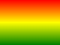 |
|
|---|---|
linear-gradient |
repeating-linear-gradient |
CSS Syntax
linear-gradient(direction | angle, color-stop1, color-stop2, ...);| Value | Description |
|---|---|
direction |
Possible values: to left, to right, to top, to bottom, to left top, to right bottom etc. |
angle |
In degrees (135deg) or proportional (0.45turn, range between 0-1) |
Each color stop should contain color information and optionally position described in percents or pixels. Suppored color formats:
- colors in RGB or HSL format:
rgb(red, green, blue),rgba(red, green, blue, alpha),hsl(hue, saturation, lightness),hsla(hue, saturation, lightness, alpha) - colors in hex:
#ff0000 - named colors:
red,green,blue,orange,pink
 |
|
|---|---|
radial-gradient |
repeating-radial-gradient |
CSS Syntax
radial-gradient(shape size at position, start-color, ..., last-color);| Value | Description |
|---|---|
shape |
Possible values: circle, ellipse |
size |
In pixels (px), proportional (%) or named sizes: closest-side, closest-corner, farthest-side, farthest-corner (default) |
position |
In pixels (px), proportional (%) or named directions: left, right, top, bottom, center |
Examples
radial-gradient(circle at top left, red, green);
radial-gradient(circle 100px at 70% 20%, red, green);           // one radius for circle
radial-gradient(ellipse closest-corner at 30% 80%, red, green);
radial-gradient(ellipse 200px 300px at 50% 60%, red, green); // two radiuses for ellipseYou can play around with CSS functions live in Magic Playground app, Hot Reload 🔥 included.


xmlns:anim="clr-namespace:MagicGradients.Animation;assembly=MagicGradients"| Timeline property | Values | |
|---|---|---|
Target |
{x:Reference myGradient} |
Reference to animated element. |
Duration |
3000 |
Length of single loop (in ms). |
Delay |
200 |
Time before animations starts (in ms). |
Easing |
{x:Static Easing.SinInOut} |
Easing function. |
RepeatBehavior |
1x, 3x, Forever |
How many times animation must be repeated. |
AutoReverse |
True, False |
If true, next loop will be animated backwards. |

Run automatically:
<magic:GradientView.Behaviors>
    <anim:Animate>
        <anim:DoubleAnimation ... />
    </anim:Animate>
</magic:GradientView.Behaviors>
Control animation from view model:
<magic:GradientView.Triggers>
    <anim:AnimateTrigger IsRunning="{Binding IsRunning}">
         <anim:PointAnimation ... />
    </anim:AnimateTrigger>
</magic:GradientView.Triggers>
AnimateTrigger is a MarkupExtension. It's shorter way of creating DataTrigger with BeginAnimation and EndAnimation as EnterActions and ExitActions.
With this type of animation you can animate single property between two values defined as From and To.
| Properties | Value | |
|---|---|---|
TargetProperty |
magic:GradientStop.Color |
Animated property with full namespace. |
From |
Value matching TargetProperty type |
Value when animation starts. |
To |
Value matching TargetProperty type |
Value when animation ends. |
Animate color sample:
<anim:ColorAnimation Target="{x:Reference AnimColor}"
                     TargetProperty="magic:GradientStop.Color"
                     From="Red" To="Yellow"
                     Duration="3000"
                     RepeatBehavior="Forever"
                     AutoReverse="True" />
Built-in property types:
ColorAnimation, DimensionsAnimation, DoubleAnimation, IntegerAnimation, OffsetAnimation, PointAnimation, ThicknessAnimation
For custom types, see Custom animation types.
| Attached properties | Values | |
|---|---|---|
anim:Storyboard.BeginAt |
from 0 to 1 |
Start animation at given point of Storyboard. |
anim:Storyboard.FinishAt |
from 0 to 1 |
End animation at given point of Storyboard. |
Animate two colors at different times:
<anim:Storyboard Duration="4000" RepeatBehavior="Forever">
    <anim:ColorAnimation Target="{x:Reference Color1}"
                         TargetProperty="magic:GradientStop.Color"
                         From="White" To="Red"
                         anim:Storyboard.BeginAt="0"
                         anim:Storyboard.FinishAt="0.8"
                         AutoReverse="True" />
    <anim:ColorAnimation Target="{x:Reference Color2}"
                         TargetProperty="magic:GradientStop.Color"
                         From="LightGray" To="DarkRed"
                         anim:Storyboard.BeginAt="0.3"
                         anim:Storyboard.FinishAt="1"
                         AutoReverse="True" />
</anim:Storyboard><Type>AnimationUsingKeyFrames
<Type>KeyFrame properties:
KeyTime- time when value is applied to animated targetValue- of type<Type>Easing- easing function
Move radial circle between corners, at different times:
<anim:PointAnimationUsingKeyFrames Target="{x:Reference Radial2}"
                                   TargetProperty="magic:RadialGradient.Center"
                                   RepeatBehavior="Forever">
    <anim:PointKeyFrame KeyTime="1000" Value="0.9,0.1" />
    <anim:PointKeyFrame KeyTime="1500" Value="0.9,0.9" />
    <anim:PointKeyFrame KeyTime="2500" Value="0.1,0.9" Easing="{x:Static Easing.SinInOut}" />
    <anim:PointKeyFrame KeyTime="3000" Value="0.1,0.1" />
</anim:PointAnimationUsingKeyFrames>Similar to CSS, with Magic Gradient you can posion each color with proportional value or by absolute pixels.
<magic:GradientView>
    <magic:LinearGradient>
        <magic:GradientStop Color="Red" />
        <magic:GradientStop Color="Yellow" Offset="100px" />
        <magic:GradientStop Color="Green" Offset="40%" />
        <magic:GradientStop Color="Blue" Offset="0.8" />
    </magic:LinearGradient>
</magic:GradientView>
Offset types:
0.3,30%- proportional,Offset.Prop(0.3)in code200px- absolute,Offset.Abs(200)in code- leave blank - each undefined offset will be calculated like in CSS
GradientView let's you specify size of the background with GradientSize property:
<GradientView GradientSource="..." GradientSize="0.6,0.6">
<GradientView GradientSource="..." GradientSize="200px,200px">
Proportional and absolute values are supported. Size can also be set from CSS:
.myGradient {
    background: ...;
    background-size: 60px 60px;
}
When size is set, gradient will be tiled to fill available space. You can change tile mode with GradientRepeat property. Supported values:
Repeat,repeatRepeatX,repeat-xRepeatY,repeat-yNoRepeat,no-repeat
Repeat mode can be set from CSS as well:
.myGradient {
    background: ...;
    background-size: 60px 60px;
    background-repeat: repeat-x;
}- create
ITweenerimplementation
public class DoubleTweener : ITweener<double>
{
    public double Tween(double @from, double to, double progress)
    {
        return from + (to - from) * progress;
    }
}- define animations
public class DoubleAnimation : PropertyAnimation<double>
{
    public override ITweener<double> Tweener { get; } = new DoubleTweener();
}

public class DoubleAnimationUsingKeyFrames : PropertyAnimationUsingKeyFrames<double>
{
    public override ITweener<double> Tweener { get; } = new DoubleTweener();
}

public class DoubleKeyFrame : KeyFrame<double> { }- Gradient Background for your Xamarin.Forms App - blog post
- XF Shell Gradient Flyout with Magic Gradients - blog post
- How we extended Xamarin.Forms CSS to style GradientView - blog post
- Xamarin.Forms Gradient Background For All Pages in 1 minute - blog post